Kamarere. Packaging Design
Packaging Design / Illustration / Motion Design
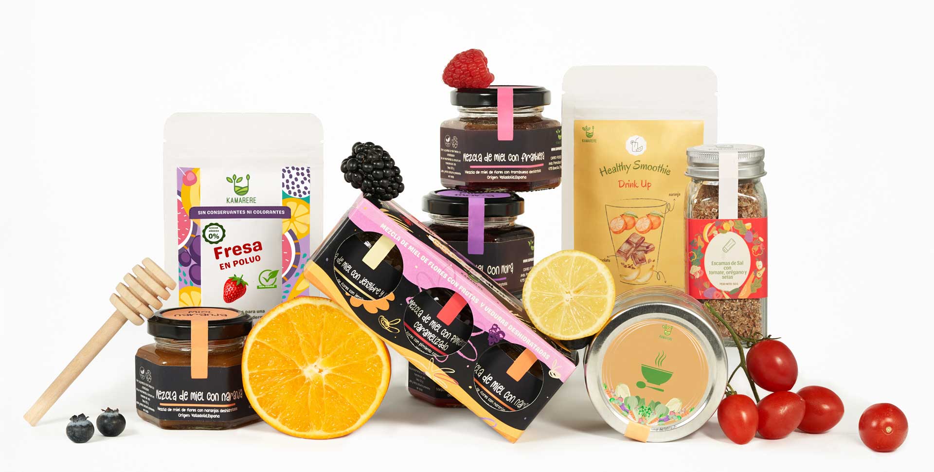
For Kamarere’s honey blends, the challenge was to create packaging that feels connected to the main brand while maintaining its own distinct identity. For the Kamarere powders line, I designed playful micro-motion GIFs that visually explain the production process, making the online experience more intuitive and engaging.
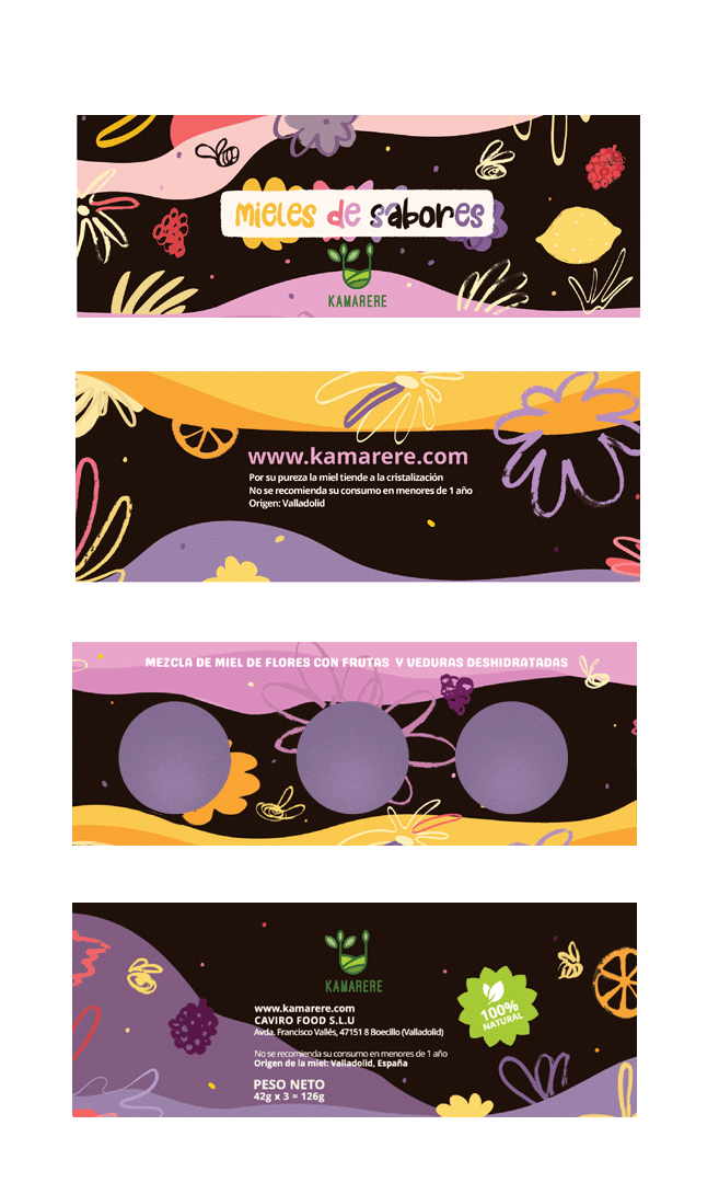
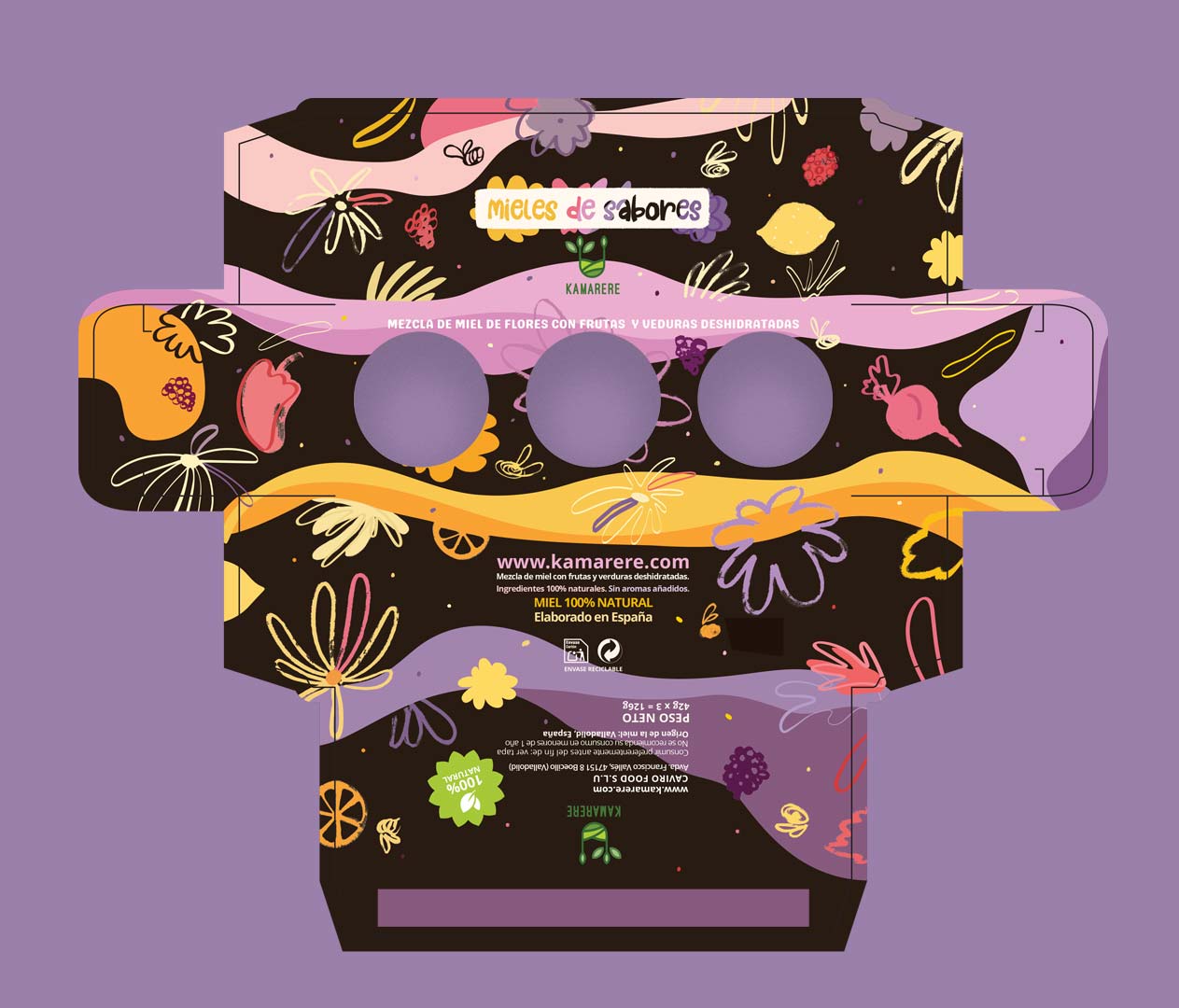
For Kamarere’s honey blends packaging, the challenge was to create packaging that felt connected to the main brand yet had its own identity. I combined nature references with artisanal cues, turning hand-drawn sketches with rough textures into digitised, coloured illustrations that preserved warmth, imperfection, and a human touch.
Colour played a key role in distinguishing the honey line from the powders: a palette of pastel yet vibrant tones (violet, orange, pink, yellow) balanced with deep browns, while hand-drawn lettering, digitally coloured and playfully composed, reinforced the artisanal, tactile feel. The result is packaging that feels harmonious, fresh, and true to Kamarere’s values.
For the Kamarere powders line online experience, I designed illustrated panels that depict the transformation of fresh fruits and vegetables into natural powders. Playful micro-motion GIFs highlight each step, visually explaining the production process for a more intuitive and engaging online experience.


