
Campbell Soup Still Life Series
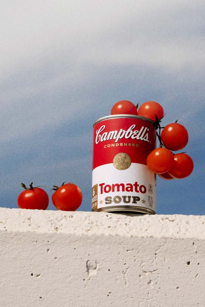
Campbell’s Tomato Soup Photography / Retouching A still life study of Campbell’s Tomato Soup, pairing bold branding with a softer editorial approach to create a modern, familiar visual language. In this conceptual still life series, the timeless visual identity of Campbell’s Tomato Soup is explored through fresh, tactile storytelling. The images juxtapose the brand’s unmistakable red-and-white label with vibrant tomatoes, placing a mass-produced icon in direct dialogue with its natural inspiration. Shot in a mix of crisp studio light and atmospheric outdoor settings, the compositions range from clean minimalism to casual, everyday moments. This visual approach bridges commercial product photography with an editorial look, paying homage to pop culture history while introducing a softer, more approachable styling that feels both contemporary and familiar.
Bread Balance

Bread Balance Art Direction / Set Design / Product Photography Who says food photography has to be all about rustic scenes and traditional vibes? In this series, an elegant, minimalist approach meets the timeless beauty of the product. With clean lines and understated charm, each image invites the audience to rediscover the humble loaf in a new light. Get ready to fall in love with bread all over again as it harmonizes effortlessly with modern aesthetics. Who says food photography has to be all about rustic scenes and traditional vibes? Get ready to fall in love with bread all over again as it harmonizes effortlessly with modern aesthetics.
Tasty Treats

Tasty Treats Art Direction / Set Design / Product Photography Tasty Treats is a delicious exploration that brings together the delightful world of frozen sweets and artistic set design. The goal is to revolutionize the joy of indulging in ice creams and milkshakes, seamlessly melding rich flavors with visually captivating scenes. Tasty Treats is a delicious exploration that brings together the delightful world of frozen sweets and artistic set design.
Call me Dairy
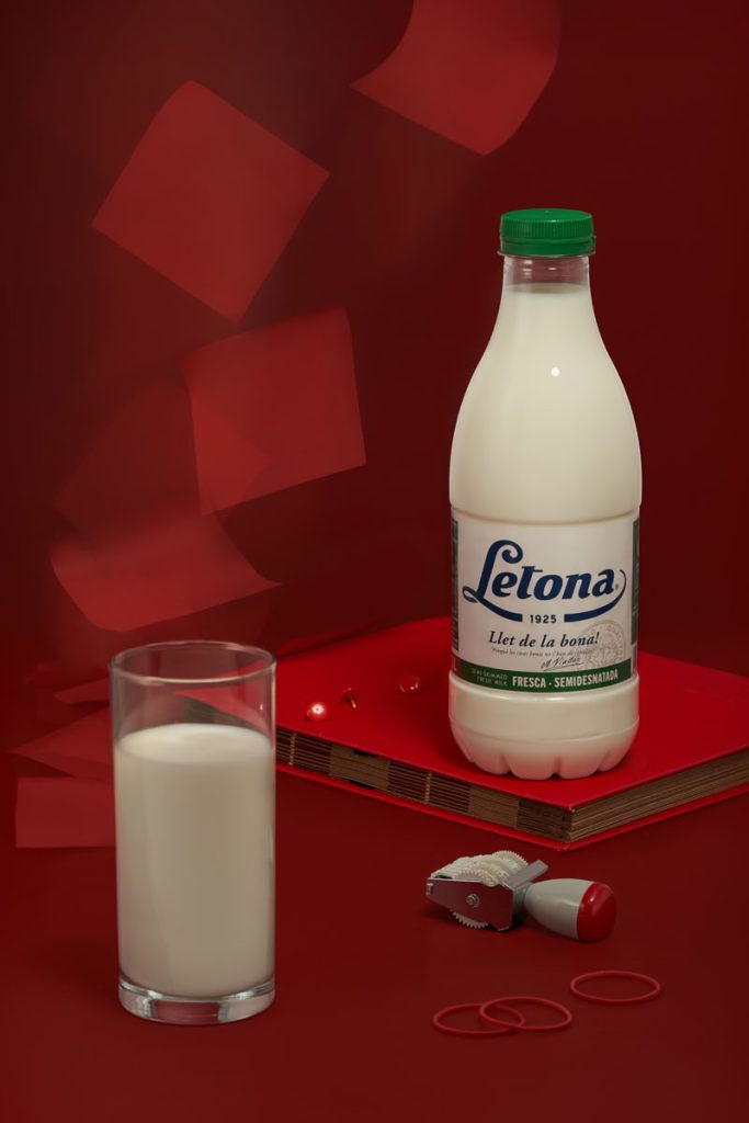
Call me Dairy Still Life Photography / Retouching A concept-driven still life series that transforms a simple product – a Letona milk bottle – into a symbolic, cinematic moment. A still life doesn’t stay still, with nostalgic design elements and a surreal, minimal red backdrop, exploring fragile balance and tension between childhood memories and shifting moments in time. This still life series captures the delicate tension between calm and alertness, memory and interruption. The work invites viewers into a suspended moment, resonating with echoes of the past and broken memories resurfacing in staged stillness. It embodies a breath held before change — a visual meditation on fragility, memory, and the unresolved. A still life that doesn’t stay still, featuring nostalgic design elements and a surreal, minimal red backdrop, exploring fragile balance and tension between childhood memories and shifting moments in time.
Kamarere
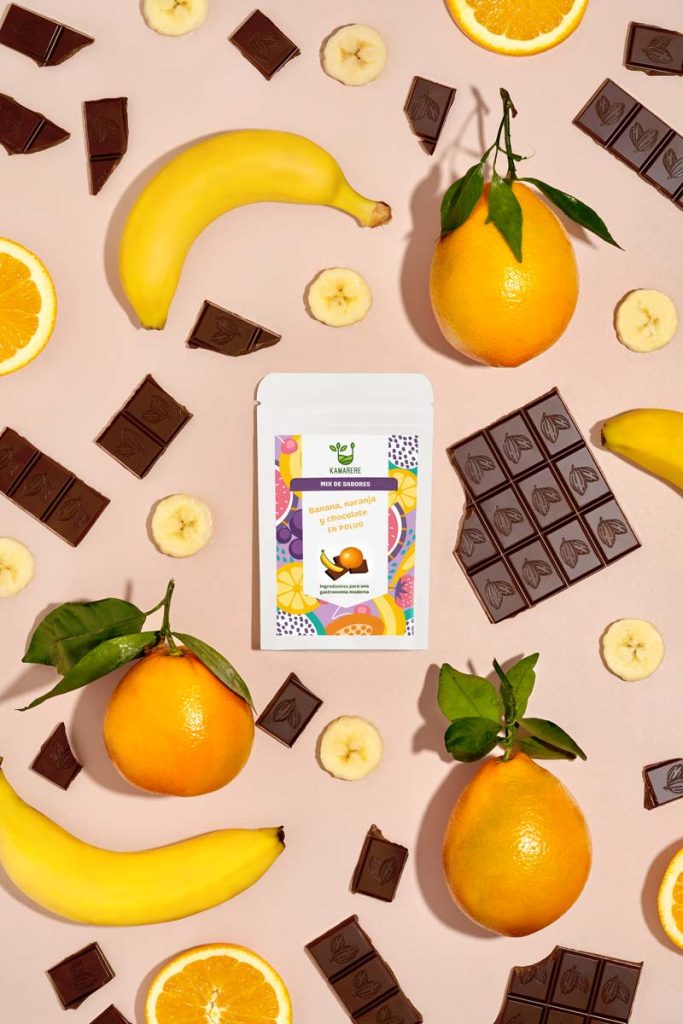
Kamarere Art Direction / Set Design / Product Photography / Stop Motion Kamarere brand is committed to being part of the solution to food waste and promoting healthier eating habits. By utilizing locally sourced ingredients, it aims to make a positive impact on both our communities and the environment. As part of my collaboration with Kamarere, I have developed an extensive creative content campaign encompassing a series of photos, short videos, and stop-motion animations showcasing natural ingredients paired with original packaging designs. Creative content campaign for Kamarere, promoting sustainable practices and healthier eating. https://vimeo.com/1125459721https://vimeo.com/1125464279https://vimeo.com/1125467626
Games & Drinks

Games & Drinks Art Direction / Set & Prop Design / Still Life Photography / Stop Motion In this studio-led campaign, the spotlight is on family hobbies during the holiday season. The set features a series of vibrant, commercial sets where Games & Drinks take center stage. The imagery brings to life moments of friends and families engaged in board games, accompanied by delightful beverages. In these vibrant commercial sets, family holiday hobbies take center stage with Games & Drinks. https://vimeo.com/1125871044https://vimeo.com/1125848781https://vimeo.com/1125862970https://vimeo.com/1125864536
BBQ Sauce
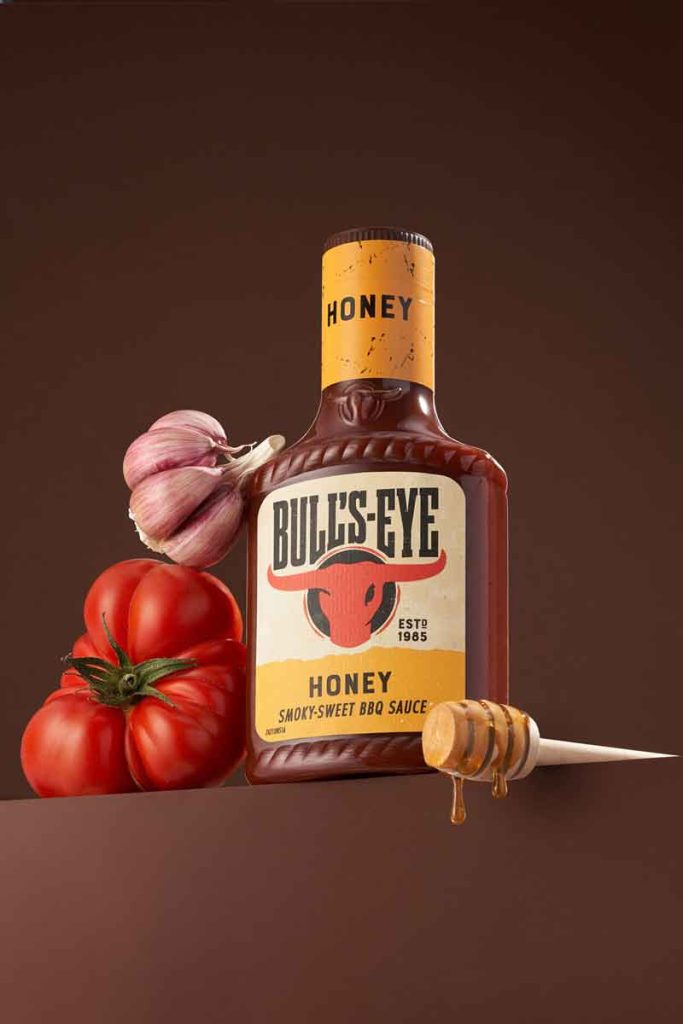
BBQ Sauce Commercial Product Photography / Retouching This commercial food photography project for Bull’s-Eye BBQ Sauce focuses on creating a powerful, market-ready look that commands attention. Each composition pairs the bottle with its key ingredients (tomatoes, garlic, onion, honey) styled with precision to enhance the brand’s bold, smoky character. Rich, warm backgrounds set the tone for a flavour-packed narrative, while strategic lighting ensures the label and brand identity remain the focal point. This is product photography created for advertising, packaging visuals, and online retail, where the right balance of storytelling, food styling, and commercial clarity turns a simple product shot into a brand statement. Capturing the nostalgic essence of seasonal changes in a photoshoot with beauty products.
Chivers Marmelade
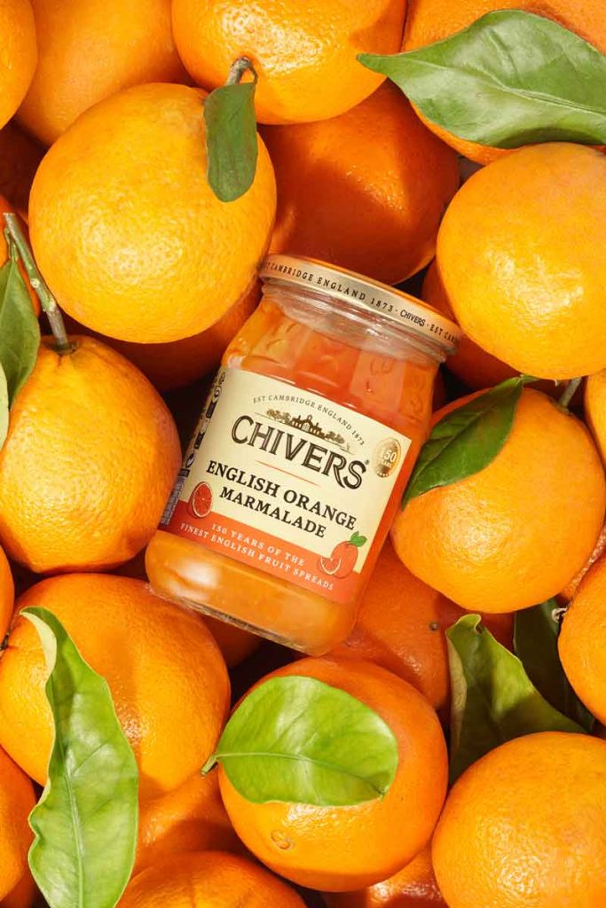
Chivers. English Marmelade Photography / Retouching Chivers English Marmelade. Traditional flavours in bright visual journey for e-commerce and marketplace audiences. For Chivers, the goal was to create a bright visual journey for e-commerce and marketplace audiences. This series blends clean product photography with context-rich food styling: the hero jar surrounded by a lush bed of sun-kissed oranges, the label crisp and readable, and a close-up that celebrates the marmalade’s exquisite texture: glossy, jewel-like slices suspended in amber. Every composition is designed to balance appetite appeal with commercial clarity, ensuring the product stands out in both search results and product pages. Lighting, symmetry, and vibrant colour converts the brand’s traditional English preserve into a clickable experience that sells freshness as much as flavour.