
Frozen Delights

Frozen Delights Desserts for Sweet Escapism Frozen Delights animated GIFs are quiet celebrations of simple, tasty moments and fleeting sweetness. With soft pastel tones and flowing drips, this series explores the joy of sensory experiences—melting textures, creamy swirls, and playful toppings captured just before they disappear. Each piece is a small celebration of indulgence, crafted with gentle warmth and a touch of nostalgia. Rendered in blush pinks, buttery creams, and rich cocoa browns, the palette speaks in soft tones—light, dreamy, and unhurried. Like a memory of summer or a moment of pause in a busy day, Frozen Delights seeks to hold the ephemeral, to make joy visible in its simplest, sweetest form. Frozen Delights captures fleeting moments of sweetness through soft pastels and melting textures. A gentle celebration of indulgence, crafted to savor joy before it disappears
Dual Path

Dual Path Animated Diptych of Sacred Tales “Dual Path” is a playful and poetic reimagining of two of the most enduring myths of human origin and consequence: Dante’s descent into Hell, and the biblical tale of Adam and Eve. This series explores the stories through a surreal, almost mischievous lens, blending absurdity, tenderness, and visual fantasy. In The Path, Dante’s infernal journey takes a humorous turn, filled with curious creatures and peculiar landscapes. Adam and Eve offers a paradise that is neither lost nor tragic, but full of humor, innocence, and flirtation. It approaches the iconic story of temptation with a wink, inviting viewers into a light-hearted, fantastical world. Together, these works form a visual diptych — reminiscent of classical church panels and narrative pairings, but reframed through an artistic, contemporary lens. Through symbolic play, rich palettes, and tonal shifts, the series invites us to explore ancient stories in fresh, unexpected ways. Two ancient tales — one of descent, one of creation — reimagined through humor, warmth, and visual fantasy. Dual Path journeys playfully through Dante’s Hell and Eden’s temptation, blending myth with whimsy, and fire with color. https://vimeo.com/1126244498https://vimeo.com/1126245658
Tasty Pleasures

Tasty Pleasures Gourmet Fantasies in Animated Loops Tasty Pleasures is a series of animated GIFs that merges everyday indulgences with the elegance of nature. Through gentle palettes and subtle surrealism, it explores a tender coexistence between what we savor and the organic world that surrounds us. Donuts bloom like vibrant flowers, coffee settles peacefully in green gardens, and wine flows within leafy settings. A visual metaphor for the harmony of human joy and nature’s beauty. The series invites us to see delight not as a distraction from nature, but as a part of it. Tasty Pleasures unites everyday treats with the natural world, showing indulgence as part of everyday poetry. Soft surreal scenes reveal joy blooming in harmony with organic beauty. https://vimeo.com/1125582767https://vimeo.com/1125616405https://vimeo.com/1125614687
Harvest Still Life
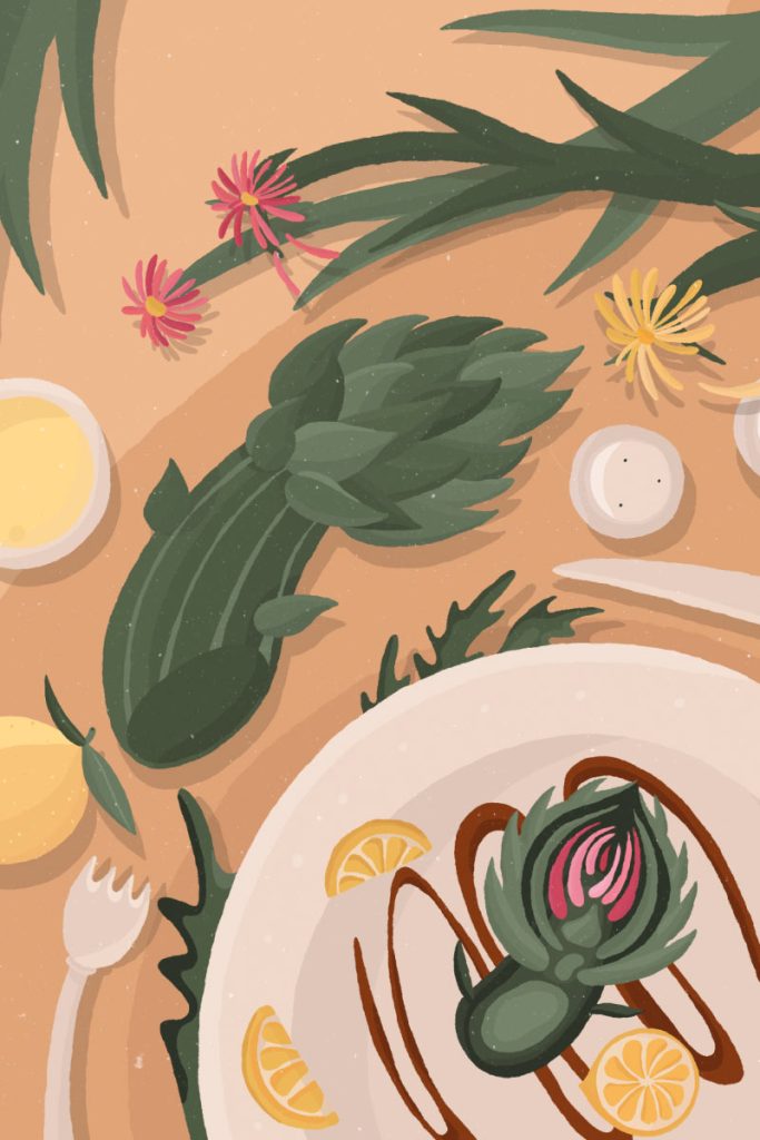
Harvest Still Life Illustrated Still Lifes of Autumn’s Quiet Beauty «Harvest Still Life» seeks to capture the quiet heart of autumn in still moments. Foraged leaves, delicate blooms, mushrooms, and vintage tools find rest in flat, thoughtful arrangements. Bathed in soft beige tones, these carefully placed objects invite contemplation of the season’s gentle beauty. This series is an intentional pause, a way of noticing the subtle elegance often overlooked. It’s an invitation to see the quiet poetry inherent in fall’s offerings and the unassuming loveliness of everyday things. Through simple compositions and a warm palette, it encourages a slower appreciation of the natural world as it gracefully transitions. «Harvest Still Life» captures autumn’s quiet beauty in flat lay arrangements of natural objects and vintage tools, inviting a gentle contemplation of the season’s understated elegance.https://vimeo.com/1125569660https://vimeo.com/1125576636
Kamarere Packaging Design
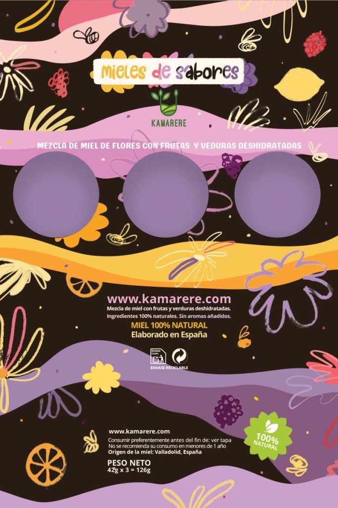
Kamarere. Packaging Design Packaging Design / Illustration / Motion Design For Kamarere’s honey blends, the challenge was to create packaging that feels connected to the main brand while maintaining its own distinct identity. For the Kamarere powders line, I designed playful micro-motion GIFs that visually explain the production process, making the online experience more intuitive and engaging. For Kamarere’s honey blends packaging, the challenge was to create packaging that felt connected to the main brand yet had its own identity. I combined nature references with artisanal cues, turning hand-drawn sketches with rough textures into digitised, coloured illustrations that preserved warmth, imperfection, and a human touch. Colour played a key role in distinguishing the honey line from the powders: a palette of pastel yet vibrant tones (violet, orange, pink, yellow) balanced with deep browns, while hand-drawn lettering, digitally coloured and playfully composed, reinforced the artisanal, tactile feel. The result is packaging that feels harmonious, fresh, and true to Kamarere’s values. For the Kamarere powders line online experience, I designed illustrated panels that depict the transformation of fresh fruits and vegetables into natural powders. Playful micro-motion GIFs highlight each step, visually explaining the production process for a more intuitive and engaging online experience. https://vimeo.com/1110735375?fl=pl&fe=shhttps://vimeo.com/1110964431?fl=pl&fe=sh
Terraquote-Brand-Design
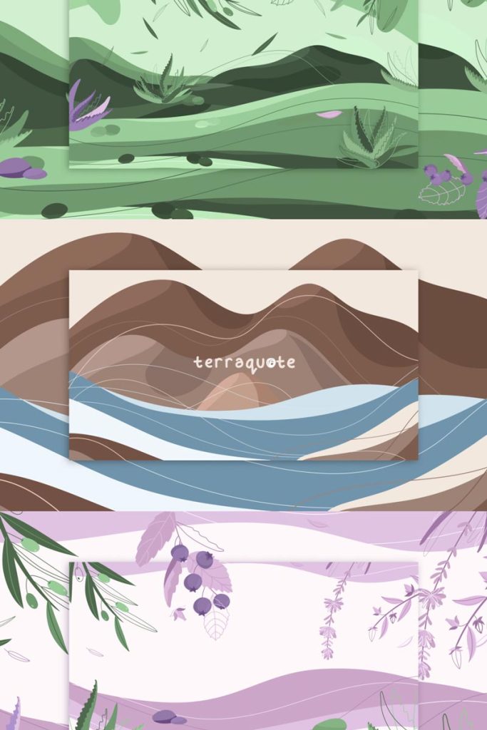
Terraquote. Brand Design Brand Design / Illustration I created a full brand identity for Terraquote, reflecting their natural, Mediterranean roots and eco-friendly values through design, illustration, and photography. Terraquote handcrafted soap bars are born from the land, shaped by nature, and enriched with textures that echo the stories of the earth. Inspired by the vibrant hues of soap bars and the raw beauty of their ingredients, I created branding 360º, brand design, illustration and product photography for online store that reflects the essence of this Mediterranean brand. Every aspect of the branding, from packaging to client interaction and shopping experience, embodies the brand’s commitment to natural self-care and eco-consciousness.
Map for Young Explorers

Illustrated Map for Young Explorers Illustration / Infographics This illustrated map was commissioned as part of an initiative to enhance educational tourism experiences for young visitors, students, and families exploring the natural parks of Catalonia. Designed as a large-format piece, it offers a visually engaging introduction to the region’s diverse wildlife, traditional architecture, and cultural landmarks. Blending simple iconography with playful illustrations, the map was created to be both functional and inspiring—intended for display in visitor centers, schools, and interpretive spaces. My focus was on crafting a piece that sparks curiosity and fosters a deeper connection with the landscape in a creative, accessible way. This illustrated map was commissioned as part of an initiative to enhance educational tourism experiences for young visitors, students, and families exploring the natural parks of Catalonia.